Introduction: Why Do Correctly Exposed Photos Still Look Boring?
Once you understand aperture, shutter speed, and ISO, you will consistently get properly exposed photos. Yet, many beginner images still feel flat and uninspiring.
Technical settings determine whether an image is sharp and bright, but composition gives an image its soul and visual impact. Composition is the art of visual guidance—it directs the viewer's eye exactly where you want it to go.
This guide breaks down 3 timeless composition rules alongside perspective shift techniques to instantly give your photography depth, balance, and intentionality.
Chapter 1: The Rule of Thirds — Moving Beyond Dead Center
The natural instinct for beginners is placing every subject dead center. While central framing works well for symmetrical architecture, it often makes everyday shots look static and rigid.
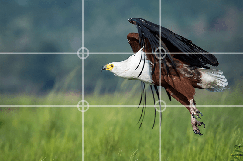
- The Concept: Turn on your camera’s grid overlay. The frame is divided into 9 equal sections by two horizontal and two vertical lines, creating 4 intersection points (Power Points).
- Practical Application:
- Subject Placement: Position key focal elements (such as a subject's eye, a single coffee cup, or an isolated tree) along one of these grid lines or intersections. This creates visual tension and breathing room.
- Horizon Placement: Avoid placing the horizon right in the middle. For dramatic skies, align the horizon with the lower third. For rich foreground textures, align the horizon with the upper third.
Chapter 2: Leading Lines — Crafting Three-Dimensional Depth
A photograph is a two-dimensional flat plane. Lines are your most effective tool to introduce depth and draw viewers into the frame.
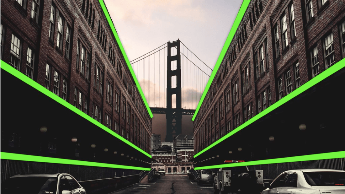
- The Concept: Utilize continuous physical lines in the environment to guide the viewer’s eye seamlessly from the foreground straight to your subject.
- Common Leading Line Elements:
- Straight or winding roads, sidewalks, and railway tracks.
- Architectural corridors, railings, and structural pillars.
- Natural rivers, coastlines, and forest paths.
- Practical Application: Start your lines from the bottom corners of the frame and direct them toward your primary subject, creating a natural sense of travel and immersion.
Chapter 3: Framing — Adding Depth and Layering
When dealing with busy surroundings or an isolated subject, framing creates an internal border that locks in the viewer's focus.
- The Concept: Use foreground elements to build a natural "frame within a frame" around your subject.
- Common Framing Elements:
- Built structures: Windows, doorways, archways, bridge underpasses, mirrors.
- Natural elements: Overhanging tree branches, dense leaves, rock formations.
- Light & Shadow: Shooting from deep shadows through to a bright opening.
- Practical Application: Framing obscures distractions on the edges of your image while establishing three distinct visual layers (foreground, midground, background) for a cinematic feel.
Chapter 4: Perspective Shifts — Breaking Away from Eye Level
Most uninspired photos are taken standing up with the camera held directly at standard eye level. Shifting your physical vantage point changes how ordinary scenes feel.
- Low Angle (Shooting Upward): Squat down or place the camera near the ground. This adds scale and presence to architecture, elongates subject proportions, and cleans up distracting ground clutter.
- Top-Down / Flat Lay (Bird’s-Eye View): Position the camera 90 degrees directly above the surface. This works exceptionally well for brunch setups, desk workspaces, stationery, and organized products, accentuating geometric order and design aesthetics.
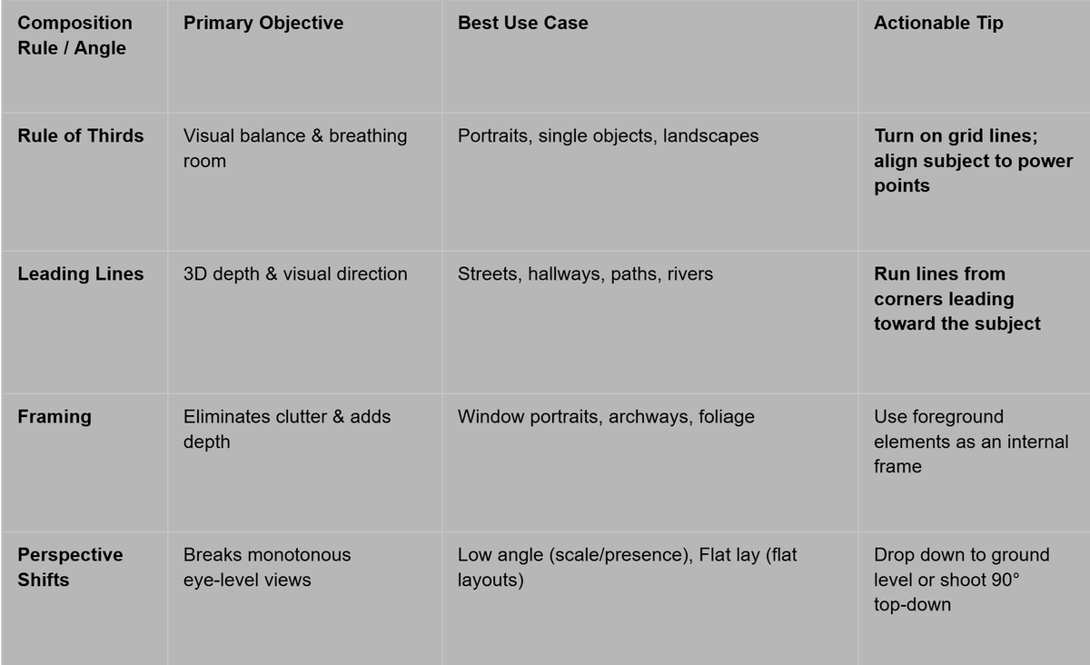
Quick Reference Summary
Grab your camera or smartphone, step into your environment, and complete these 3 targeted exercises:
- The Grid Test: Take two photos of the same object—one dead center, and one aligned with a Rule of Thirds intersection point. Compare the balance between the two.
- Hunt for Lines: Locate a hallway, staircase handrail, or path. Position your camera so the lines start at the bottom corner and lead directly to a focal subject in the distance.
- Vantage Point Shift: Pick an everyday object (a coffee cup or a pair of shoes) and capture it from three angles: standard eye level, low-angle ground level, and a 90-degree flat lay. Observe how the mood shifts.
[Intro: Why Do Photos Look Like Boring Snapshots?]
Many people get their camera settings right and achieve perfect exposure, but their photos still feel flat—like generic tourist snapshots.The problem usually isn’t your camera; it is your composition.
Composition acts as a visual GPS, guiding your viewer’s eyes exactly where you want them to go.
In this video, we will cover 3 timeless composition rules along with 2 perspective shifts to instantly give your photos narrative depth and cinematic punch.
[Point 1: The Rule of Thirds]
The biggest habit beginners have is placing everything dead center.While central framing works for symmetry, it often makes everyday shots feel stiff and boring.
Turn on your camera or phone's 3x3 grid lines.The 4 intersection points where these lines meet are your visual sweet spots.
Try placing your subject—like a person’s eyes, a cup of coffee, or a solitary tree—on one of these intersection points.
This immediately gives your shot natural balance and visual breathing room.
The same applies to landscapes: if the sky is stunning, keep the horizon on the lower third; if the ground textures are rich, place it along the upper third.
[Point 2: Leading Lines]
A photograph is a flat 2D plane, but the real world is three-dimensional. The easiest way to add depth is by using lines.
Look around your environment: roads, hallways, stair railings, or even crosswalk stripes.Start these lines from the corners of your frame and let them point directly toward your subject.
The viewer’s eyes will naturally follow the lines straight into the scene, creating a powerful sense of travel and immersion.
[Point 3: Framing]
When your background is messy or your subject isn't standing out, use Framing.
Find foreground elements to create a natural "frame within a frame" around your subject.Look for windows, doorways, overhanging branches, or gaps between buildings.
This internal frame hides messy edge distractions and creates three distinct layers—foreground, midground, and background—giving your image a distinct cinematic feel.
[Point 4: Perspective Shifts]
Here is the ultimate takeaway: stop taking every photo standing up at standard eye level.
Try these two perspectives:First, get low to the ground and shoot upward. This low angle gives architecture scale, flatters human proportions, and clears away messy background clutter.
Second, position your camera 90 degrees straight down for a top-down flat lay. This works wonders for brunch plates, coffee tables, and desk setups, showcasing clean geometric design.
[Summary & Outro]
Let's do a quick recap:
- Rule of Thirds: Place subjects on grid intersections for visual balance.
- Leading Lines: Use roads and railings to draw the eye into the frame.
- Framing: Use windows and foliage to add depth and layering.
- Perspective Shifts: Shoot low-angle or top-down to break away from eye level.
You can find the full blog post along with homework exercises linked in the description below.Turn on your grid lines, grab your camera, and go experiment today. See you in the next one!